


NYCgo is a mobile app to help New Yorkers and tourists get the most out of NYC.
Client: NYC Tourism
Role: UX Team Lead
Timeframe: October - November 2022
The Brief
Reimagine an existing website, It’s Time for New York, as a mobile app to promote NYC venues and businesses – especially those outside of Manhattan.
Build a community around exploration of the city.
The Outcome
✅ Outperforming the competition: Our NYCgo prototype was one of several the client commissioned. Our was deemed the most successful response to the brief.
✅ Improving client decision-making: With the NYCgo prototype, NYC Tourism was able to take action on design questions that had long been roadblocked.

Unique, catered recommendations
We heard from users that the most compelling NYC activity recommendations are fresh and lesser-known, but also relevant to their personal interests.
NYCgo addresses this need by leveraging a content tagging system already in place on the NYC Tourism website. City explorers can set content preferences in their profile, and unique but catered recommendations will populate on the app's Explore tab.

Map-based planning
NYCgo makes it easy to visualize an itinerary of city activities.
Our user research showed that people want to map potential NYC activities alongside their existing commitments. With NYCgo, they can pin locations they know they'll be visiting, such as a friend’s address, to easily plan an itinerary that lines up with their existing commitments.

Social sharing
NYCgo's social feed makes it easy for NYC visitors and locals to swap recommendations and share excitement for their favorite local venues.
We heard over and over in user research that people rely on social media – primarily Instagram – to plan their time in NYC. Interviewees also consistently told us that they trust word-of-mouth recommendations the most when planning things to do in the city.
The social feed also achieves an important business goal for NYC Tourism, by creating space for marketing content and advertisements from their partner businesses.
Our Process
We asked NYC visitors and locals what matters to them when planning activities in the city.
8
user interviews (5 based in NYC, 3 based outside NYC)
languages (English, Spanish, Mandarin)
3
18-64
age range of our interviewees
Our interviewees primarily trust three sources for info about things to do in NYC:
Word-of-mouth
Instagram accounts
NYC institutions’ websites (for example, the Met site)
I find out about things to do from my friends.
“
When planning itineraries for their time in NYC, people want to map their options alongside existing commitments.
I have things to do, people I want to see, and then I schedule around that.
“
If information is too scattered, it becomes confusing.
Pain points include:
Digging for relevant information (hours, outdoor dining options, etc.) across multiple sources
Struggling to find unique recommendations that match their interests
Finding time to explore areas or topics they’re not already familiar with
“
App Map
This early iteration of our app map helped us synthesize our research findings and begin making decisions around how best to help our users meet their goals while exploring the city.

The Evolution of Our Ideas
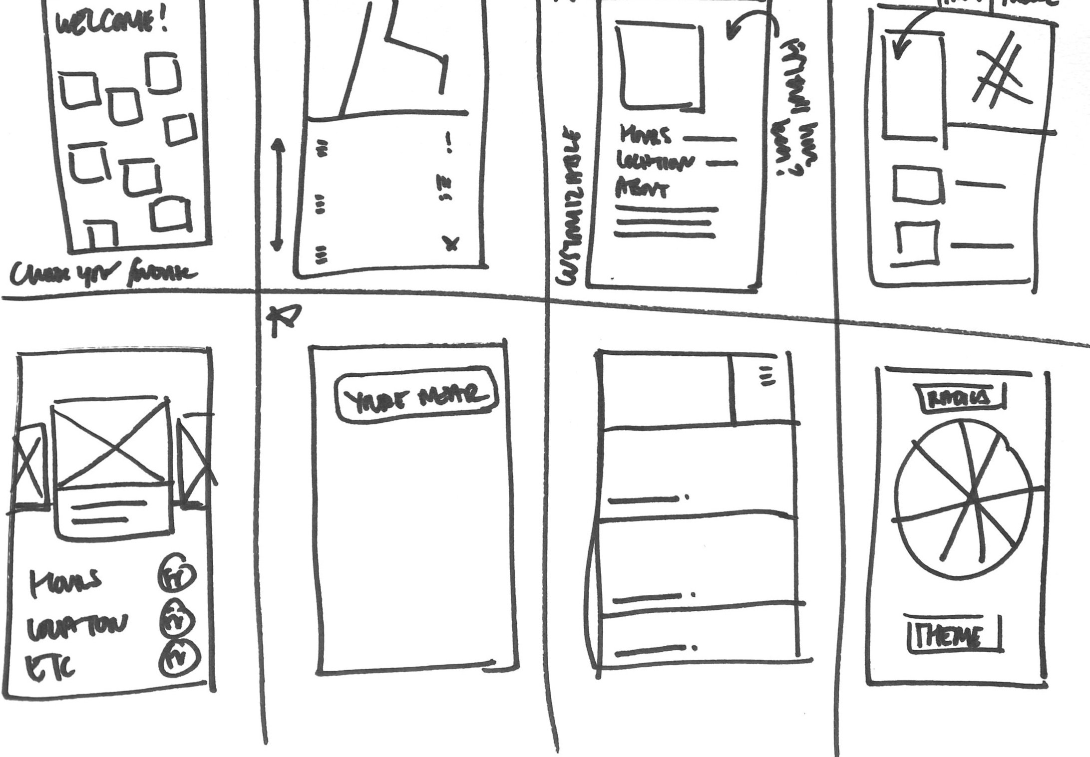
We agreed on our favorite ideas from our initial brainstorm and explored them more in depth in design workshops, where we collaboratively sketched, created lo-fi mockups, and debated design decisions.


Developing a Usable and NYC-Specific Menu
Creating Fun Moments of Surprise
Keeping the Icons Simple
One of our early ideas was a "spin the wheel" feature that would allow users to discover randomized NYC experiences once a day.
While we ultimately decided the wheel created an unnecessary step in the the user journey, the ideas of gamification and surprise remained in our evolved app design.

We developed a customizable map of things to do in New York City. We explored iconography and whether the map should have a legend to help users interpret the map.
As a result of this process, we pared down the iconography and removed the legend from further iterations to help users understand the map at first glance.


We took our navigation menu through several iterations as we honed the information architecture for NYCgo, built out our app map, and ran usability testing. One of our most important insights from testing was that people didn’t associate our original “share” icon with social media, so we swapped it for a more traditional icon. We incorporated Lady Liberty’s torch to give the menu a New York flavor, which testers enjoyed.


