The Problem
"We're losing half of our data."
Tutor supervisors at PLUS manage an incredible amount of data, including lots of data that's generated live. They must monitor tutor performance in multiple sessions simultaneously and respond to learning needs as they unfold in real time. They must also monitor tutor performance over time, manage schedules, and implement research trials determined by partners in academia.
But there’s no single source of truth for the data related to all of these responsibilities.
One tutor explained that because she’s buried in manual tasks to track down the data she needs, she only receives about half of what she should.
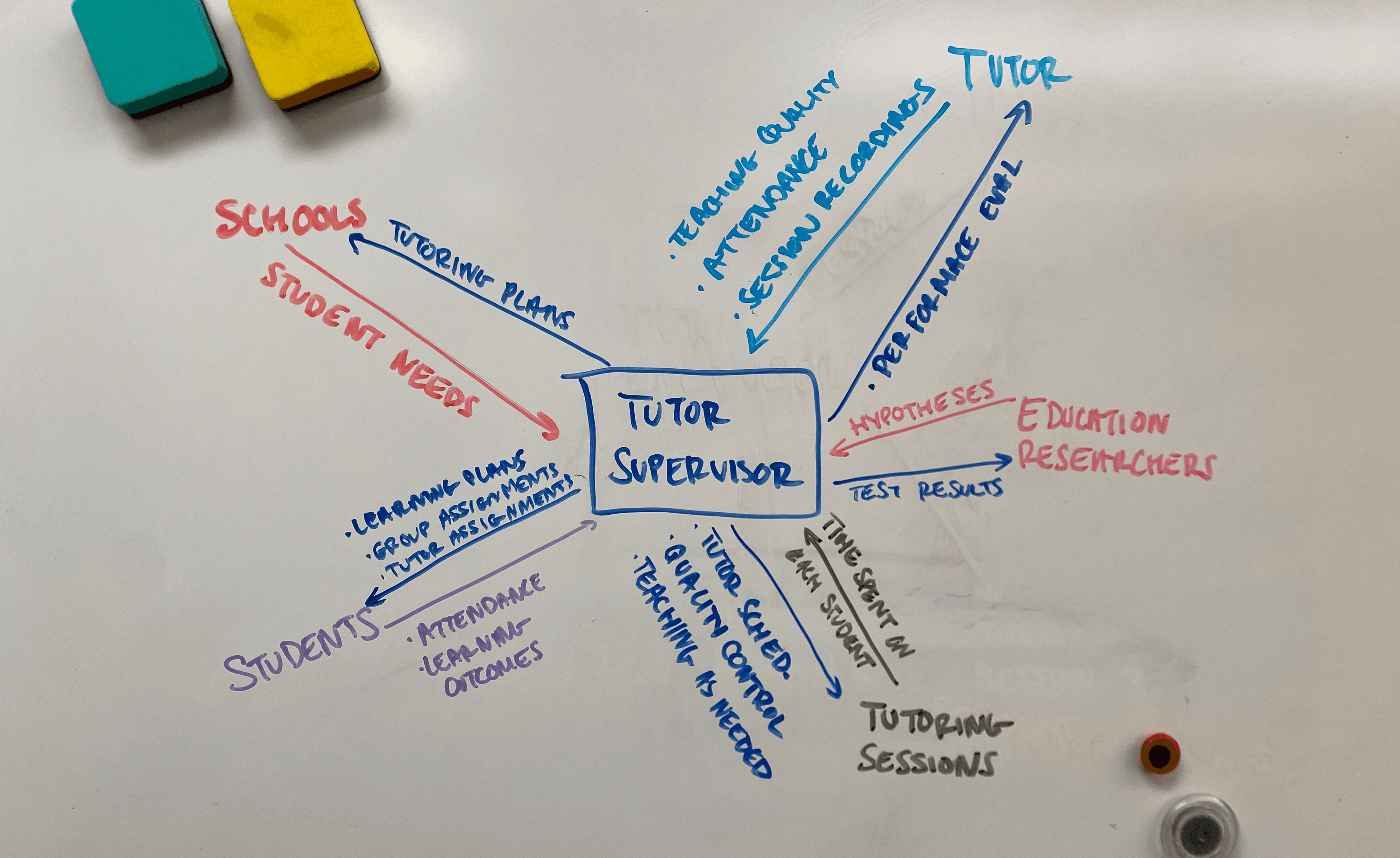
I mapped the sources of all data tutor supervisors take in and put out, to understand how the PLUS data dashboards could better serve them.
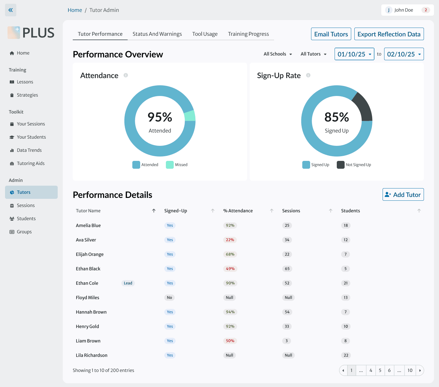
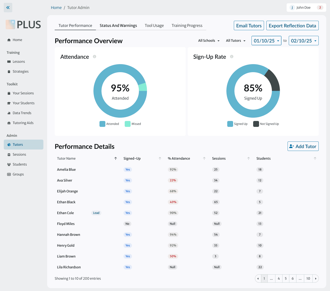
The existing data dashboard doesn't help.
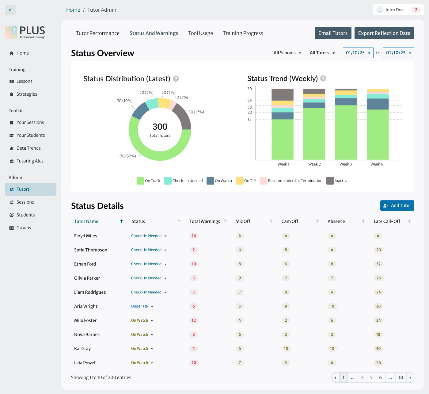
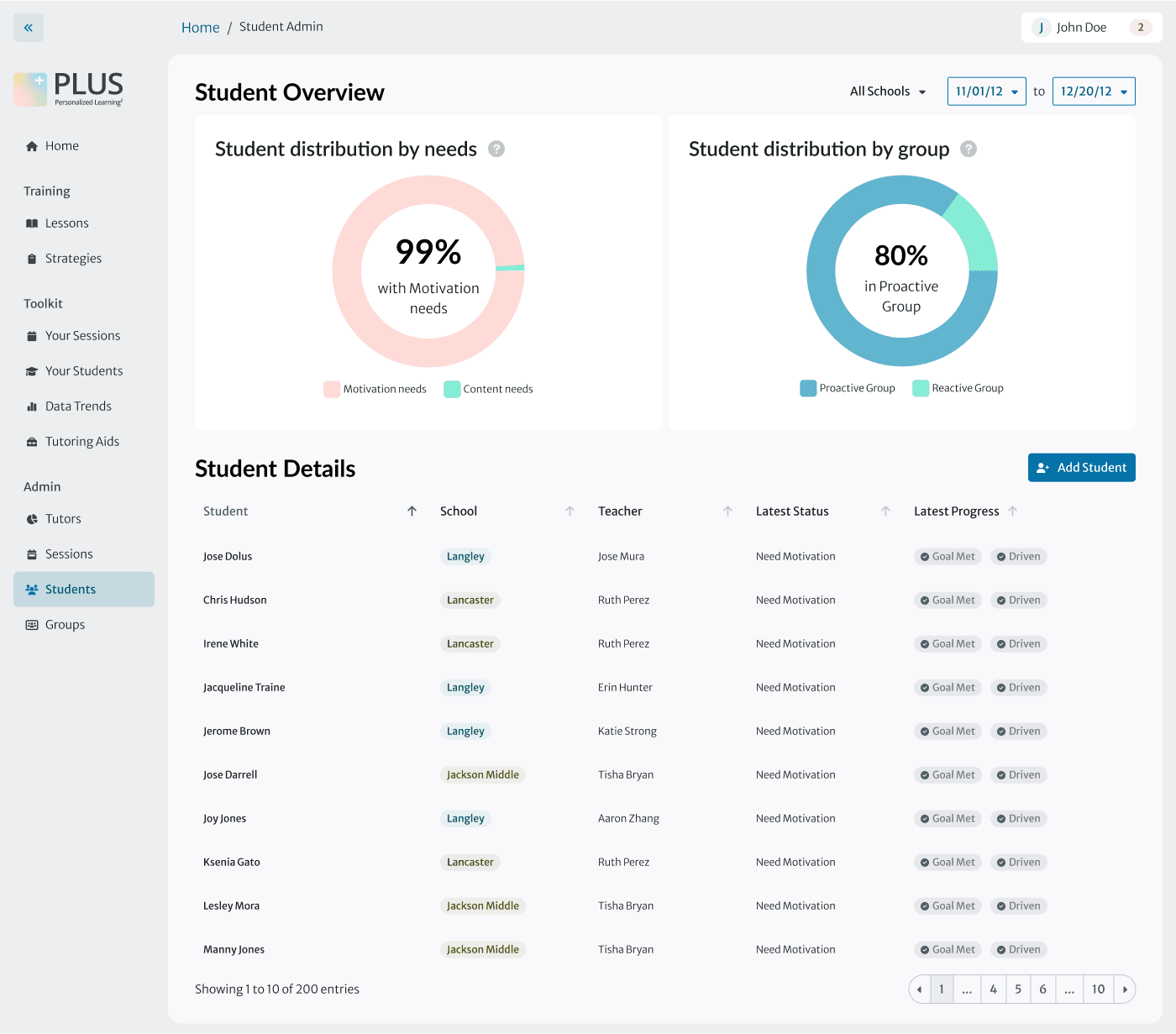
Tutor supervisors reported spending only a couple of hours on the PLUS dashboard per week, mainly for sending mass emails, because it did not provide the information they needed.
Instead, they spent much of their time manually searching for data in Slack messages, spreadsheets, and video recordings.
Helping tutor supervisors will help students.
Without easy data access, tutor teams can't make proactive decisions or predict outcomes.
If we can give tutor supervisors more time to spend on forward-thinking improvements for their teams, students will receive a higher quality education.
The existing, low-adoption tutor supervisor dashboard
Scoping
How do we balance our dreams against our constraints?
Our dreams:
Tutor supervisors easily find data within the PLUS app to make faster, stronger decisions about tutor performance and student needs.
Our constraints:
Time. We needed to ship files by the dev team’s deadline for updating our dashboard.
User hesitancy. Our users prefer lots of onboarding information before getting comfortable with major UI changes.
We prioritized design updates that would boost tutor confidence in the PLUS app and improve their day-to-day work. We’re planning a second phase to build on our improvements with AI.
⏱️ Phase 1
Incorporate data visualizations and tutor performance metrics into the dashboard
Align UI with PLUS design system and UX design best practices
🎯 Phase 2
Explore AI-powered features that will help supervisors with proactive decision-making about the tutors they manage
Update visual design for existing data visualizations (shown in next section)
Information Architecture
Design System
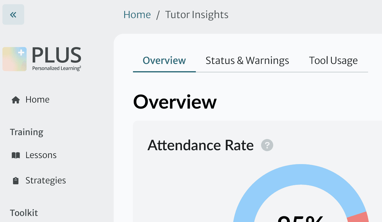
Before: Supervisors didn’t realize this nav item was clickable.
After: we reorganized content so that we could constrain ourselves to one menu item type from the design system
Adapting a modal
I adapted the design system’s customizable modal to allow supervisors to explore and change data about a specific tutor.
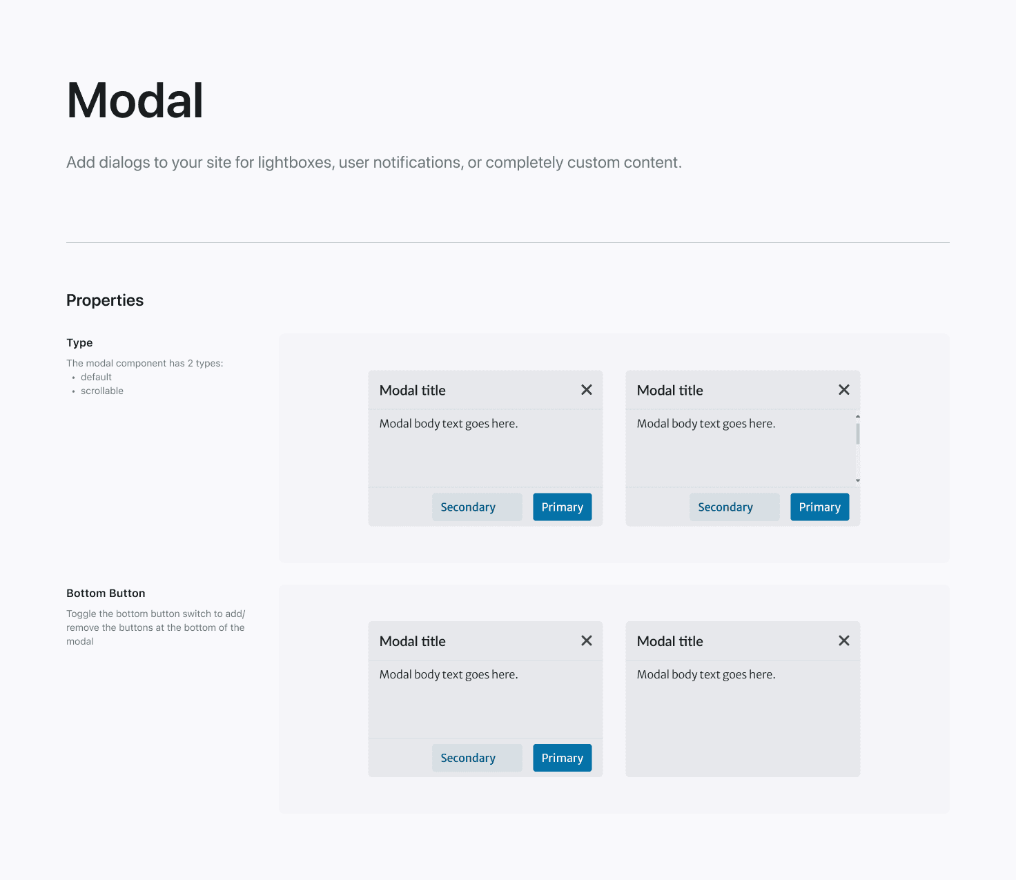
Modals as seen in the PLUS design system
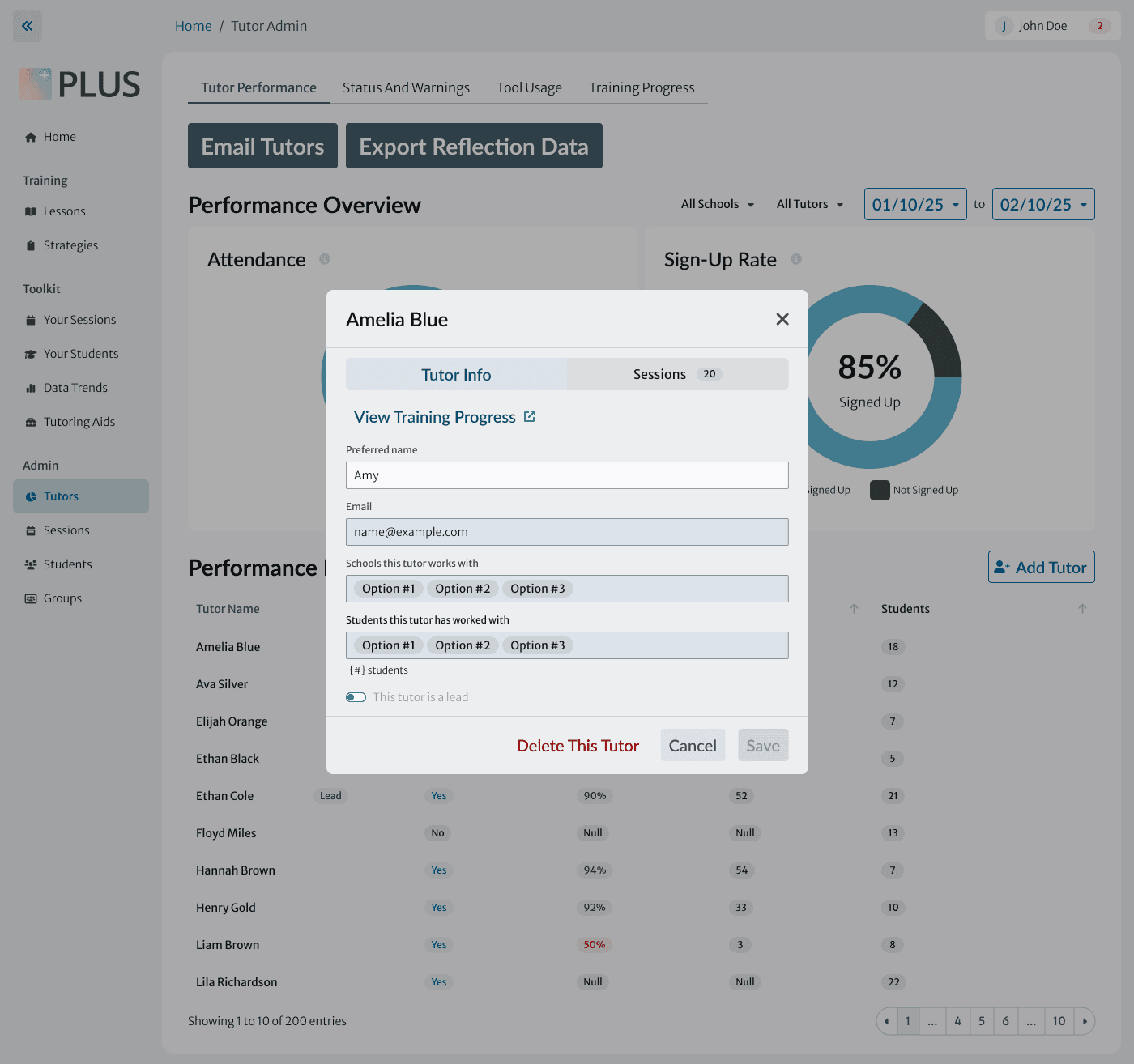
My modal for tutor details
Choosing a pagination variant
The design system allows for multiple sizes and styles of pagination. We consulted with the design system team and chose the medium-sized, unlabeled version for cohesiveness with similar dashboards elsewhere in the product.
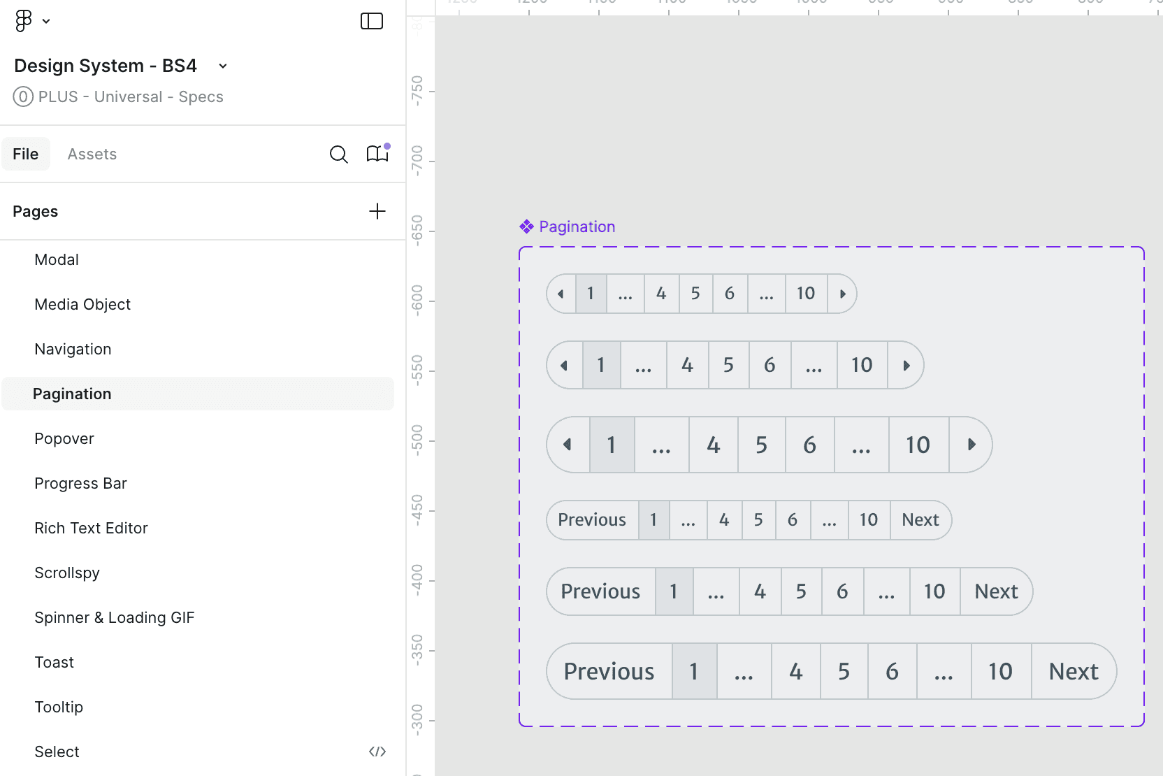
Pagination variants in the PLUS design system
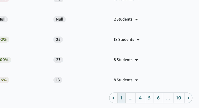
Pagination as seen in our dashboard
UI Refinement
Mapping all possible states of each table cell
With annotations for developers

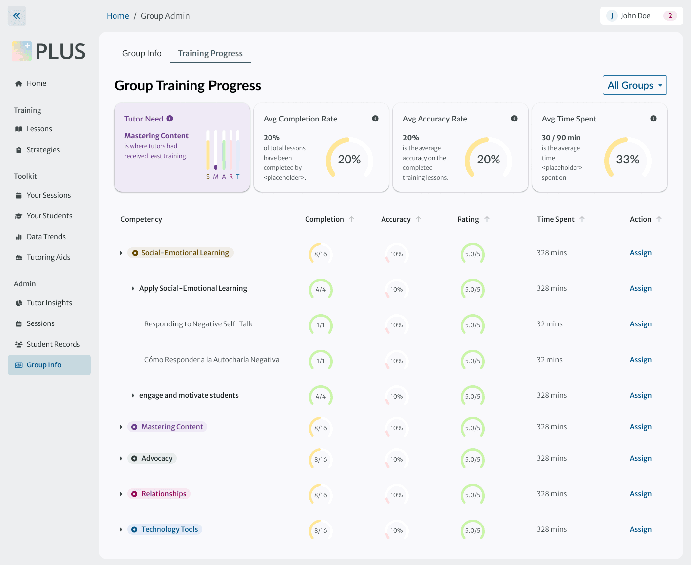
Paring down the data visualizations
Before:
Supervisors feel overwhelmed by the visualizations and immediately scroll past them.

After:
We identified the most useful visualizations for each page in interviews with supervisors. Fewer visualizations, redesigned to take up less vertical space, orient without overwhelming.
Here's a closer look at my decision-making.
While a different design team owned the data visualizations themselves, I designed the container card and overall page hierarchy to make the best use of them.

Ensuring responsiveness at 4 breakpoints

Pivot
Supervisor interviews didn’t tell the whole story.
PM feedback revealed gaps in our understanding of the problem, which we addressed in under a week.
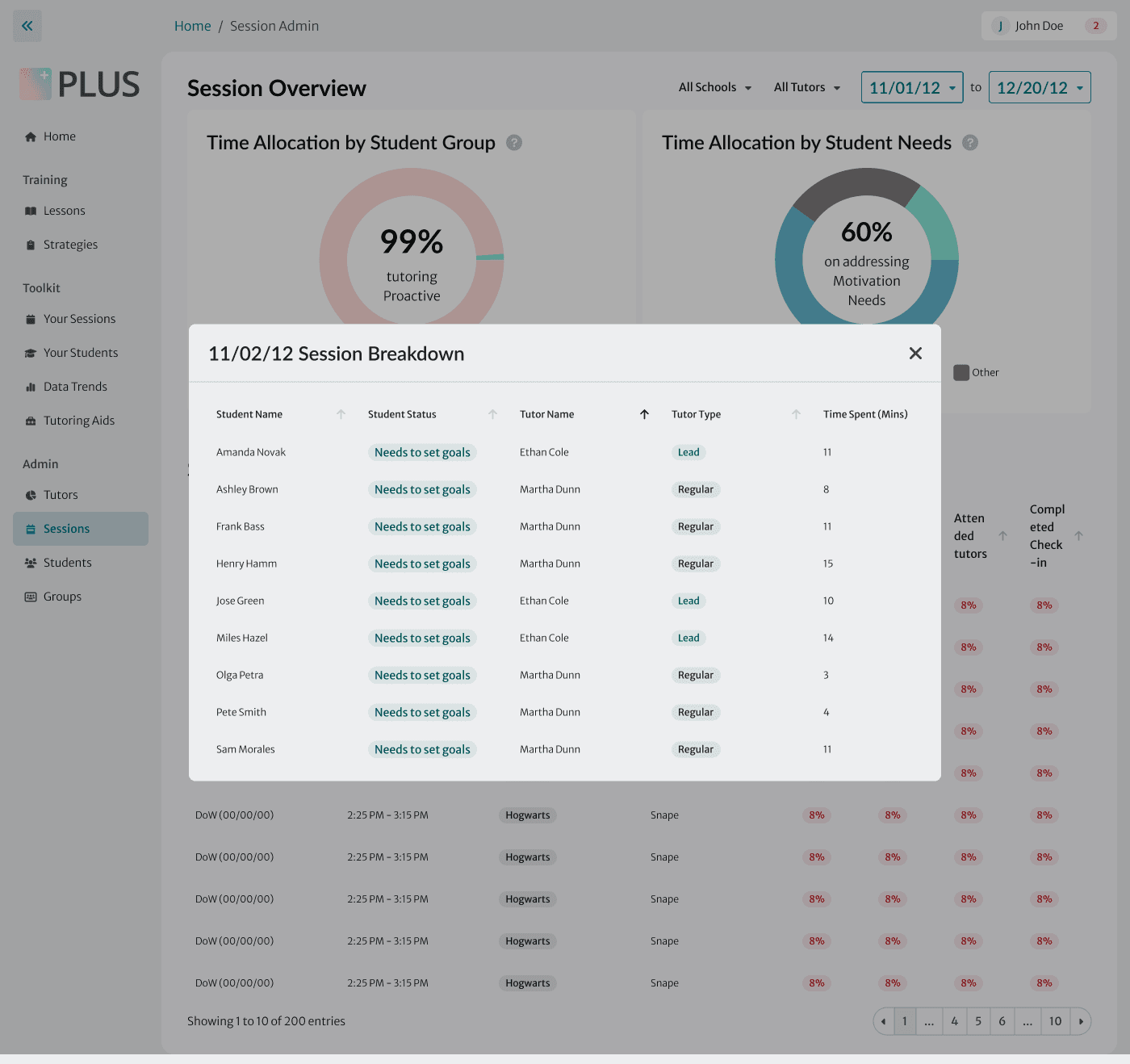
During our research interviews, tutor supervisors discussed many issues with how they access data – but didn’t mention that they are responsible for creating much of the data themselves.
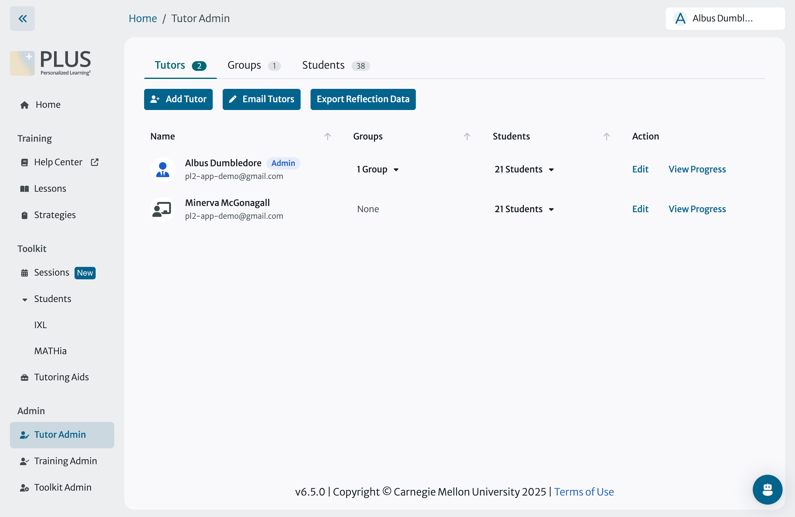
We ran a CRUD analysis with the PM to identify where and when supervisors create, read, update, and delete data. As a result of this analysis, I created a new Edit/Add Tutor modal giving supervisors full control of tutor data in one place.
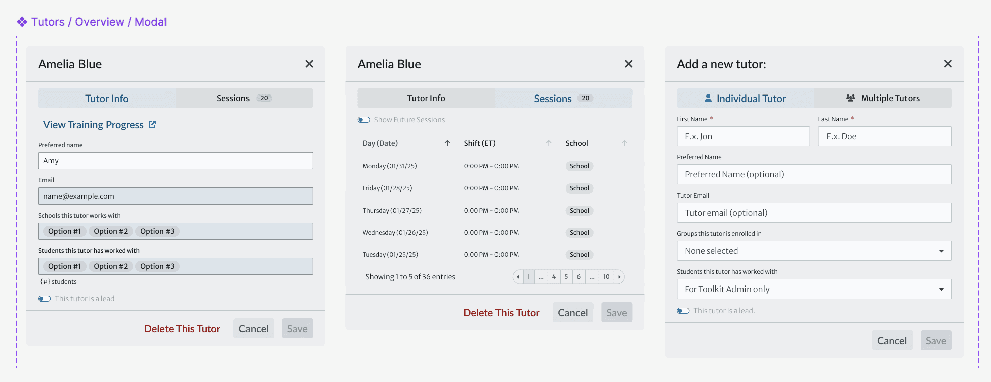
My new modal allowing supervisors to manage data about turos